DSS Student Worker Julia Stomber Researches Web Accessibility
Julia Stomber ’21
One of my tasks as a student worker at DSS is to research web accessibility, including how it can be utilized to make Lafayette’s online resources accessible to the greatest number of people. From the beginning of my research process, it was evident that web accessibility is a very broad term. While it can thought of as “a general term used to describe how easy it is for people to get to, use, and understand things [on the web]” (Joseph Dolson, “What Is Web Accessibility?“), accessibility still relates to even the smallest details of web formatting; such as font style, color contrast, and captioning.
When researching a topic like web accessibility, it often becomes overwhelming. Just Googling the phrase “how to make a site accessible” produces millions of results, many of which contain long, detailed lists of how to account for multiple disabilities at a time. For this reason, the best first step in making a website accessible is to ask the question, “what is my site doing wrong?” before asking “what is my site doing right?” Before refining the small details of your site to ensure it is accessible, first be sure that there is nothing currently in place that make it nearly impossible for those with disabilities to access your content.
For example, sites often contain online forms for users to complete. Those with disabilities are usually able to complete these forms without an issue, but problems arise when there is a time limit on forms. If an individual has visual, cognitive, or motor impairments, completing an online form takes longer, which is why an extended time limit is necessary (or no time limit at all!).
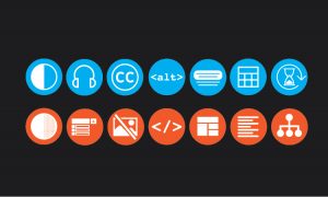
Common internet symbols relating to accessibility
Similarly, when a site contains repetitive navigation links or large blocks of content before the main content of the page, it needs to include a skip navigation link. Repetitive links and content can make it difficult and time-consuming for users that have motor or visual impairments to navigate a site.
And perhaps the most important aspect of web accessibility is also the simplest: alternative text. Alternative text is a word of phrase that can be inserted as an attribute in an HTML document to tell viewers the nature or contents of an image. Part of my job as a DSS student worker is to ensure that the blog posts and content on the DSS site have alternative text, so those using screen-readers can still understand the meaning of an image. A good place to start in making a site more accessible is to ensure every new image added to the site has alternative text – it will only take a few seconds longer to do but makes all of the difference for some.
So what has Lafayette, and more specifically, DSS, done to make its online content accessible? Just a glance at the DSS WordPress site reveals that it is neatly organized, with no unnecessary content or links, and contains an online form without a time limit. Since it uses the Hermione theme preferred by Lafayette, the DSS site is also compatible with screen-readers. It contains alternative text, meaning those with visual impairments are able to access the content without issue. Colored fonts on the site are limited to black, dark red, and dark blue, so individuals with any form of color-blindness can read the font. To account for other visual impairments, fonts are consistent and backgrounds are not overloaded with graphics. There are also no flashing lights or moving objects on the site that could cause issues for those prone to seizures or vestibular disorders. If a video was posted, DSS would also be sure to provide a transcript for those with hearing impairments.
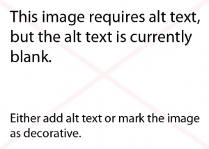
Notification from WordPress upon adding an image to the Media Library
While examples like the DSS website show that Lafayette has made significant progress in its effort to establish an accessible online experience, there is still a lot that needs to be done. I met with Greta Brubaker, the Technology Training Coordinator at Lafayette College Information and Technology Services (ITS). She emphasized how Lafayette has utilized WordPress to meet accessibility standards. In WordPress, users are prevented from using certain themes, or adding colors or fonts that would make reading difficult for a visually impaired person. WordPress also forces users to designate pictures as “decorative” if they don’t use alternative text. Along with WordPress, Lafayette also utilizes a service that examines sites monthly for broken links, spelling errors, and accessibility issues.
However, across all of Lafayette’s sites, there is some disparity when it comes to accessibility. Brubaker described Lafayette as in “good shape” in terms of accessibility, but said that the next step in improving the college’s sites is to emphasize education. This year, Lafayette is planning on offering services like it has in the past where it will complete an accessibility report for a site upon request; offering feedback and tips on how to improve accessibility. Lafayette also offers help documents for accessibility online, as well as workshops and monthly training. Brubaker hopes these resources and programs will continue and grow into the future, so that students and faculty can actively improve accessibility at Lafayette on their own.
The most important theme relating to web accessibility is that an accessible site benefits everyone, not just those with disabilities. If a web developer takes into account accessibility when designing a site, it means the experience for all users will be simple and enjoyable. Typical users and those with disabilities are the same in that they both hate an overly complicated website. An accessible site is a good site in general – just another reason why accessibility should continue to be a priority at DSS, at Lafayette, and beyond.